Service
Product Design
Product Architecture
Design System
Year
2024 – 2026
Client
TAXD0ME
My Role
Principal Product Designer
Product & Design System Architect
Project
TaxDome is the leading practice management platform for accounting, tax, and bookkeeping firms, trusted by 15,000+ practices across 25+ countries and serving over 3 million of their clients. As the product scaled rapidly, the organisation faced a structural problem: multiple product teams working across four interconnected surfaces (web platform, mobile app, desktop app, and marketing site) were making interface decisions independently, without a shared model for how experience should work across the ecosystem.
I was brought in as Principal Product Designer to diagnose this problem and define the architecture that would allow the product to scale without losing coherence. This was an organisational and systems challenge as much as a design one.
My work spanned three interconnected layers: establishing a shared product operating model, building the design system architecture that made it executable, and embedding AI-assisted workflows that turned the system from a passive reference into an active operating layer for teams.
-
Specific product details, internal data, and proprietary materials are intentionally omitted in accordance with my confidentiality obligations.

Why the system needed architecture
TaxDome was growing faster than its internal design infrastructure could support. New product domains were being added, the engineering team was scaling, and delivery pressure was increasing across all four surfaces simultaneously.
Without a shared system, each team defaulted to local decisions. Similar problems were being solved in different ways across platforms. Design intent was getting lost between Figma and implementation. New designers joining the team had no clear model to follow, which slowed onboarding and increased inconsistency over time.
The deeper issue was not visual inconsistency. It was that the organisation had no shared language for how product experience decisions should be made, documented, and reused. Every team was effectively maintaining its own partial system, which created duplication, drift, and an growing gap between what was designed and what was shipped.
The work needed to address this at the level of organisational structure, not just UI cleanup.

Key challenges
Four interconnected problems, each a symptom of the same root cause: the product was scaling faster than its shared design infrastructure could support.
Fragmented visual language across platforms
Design-to-development disconnect
Lack of shared scalability rules
Fragmented component and pattern usage
Before-state
Before defining any solution, I audited the existing state across all four surfaces to understand where decisions were being made and why the system was drifting.
Each surface had some form of partial structure. But none of it was connected. Similar patterns, states, content rules and implementation expectations differed across platforms and teams, creating a growing gap between design intent and what was actually shipped.
The conclusion was clear: this was not a UI cleanup problem. It was an organisational architecture problem.

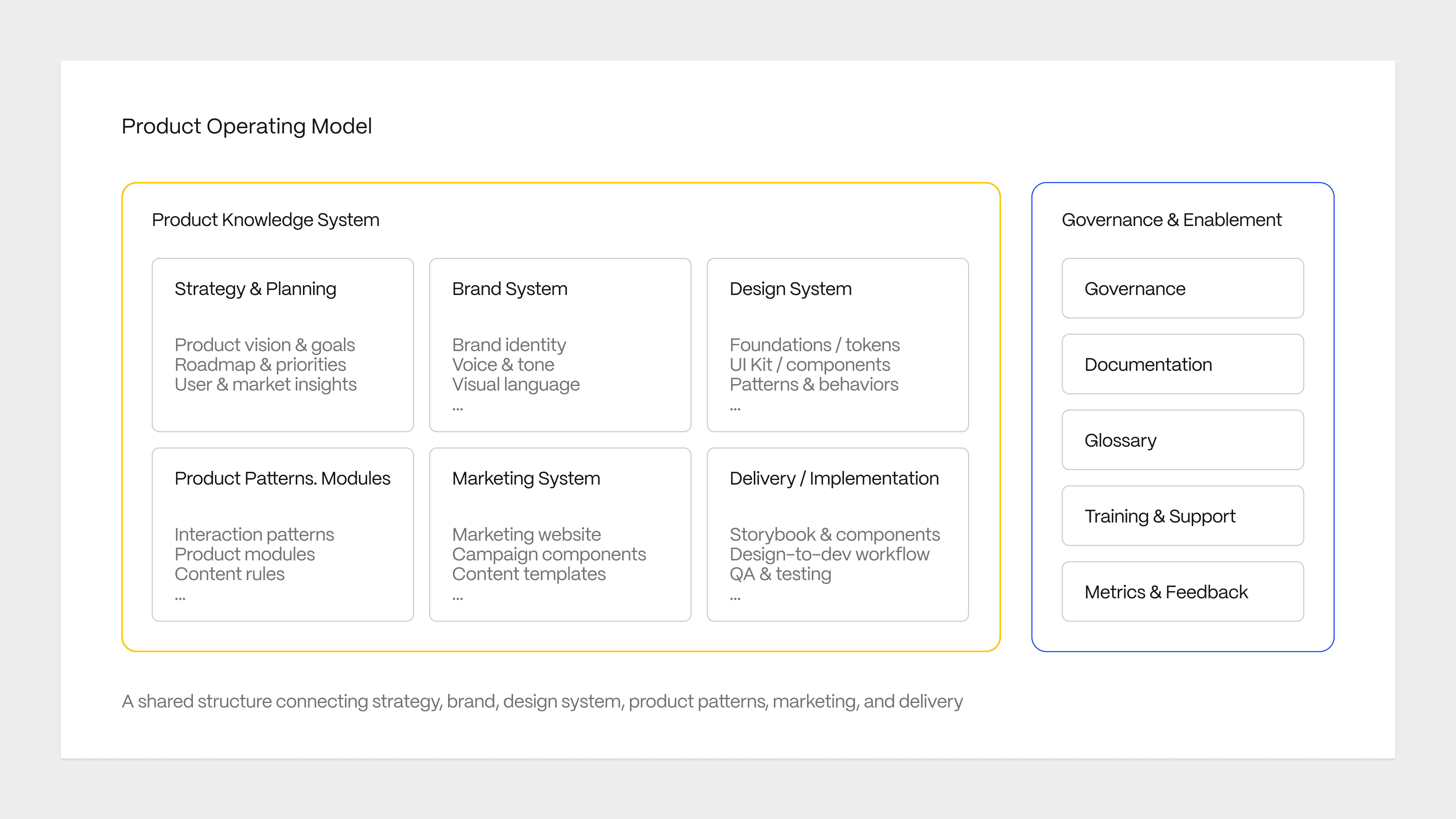
Product Operating Model
Before touching any component or pattern, I needed to answer a more fundamental question: where do product experience decisions live in this organisation, and who is responsible for them?
The operating model I defined gave teams a shared answer. It connected strategy, brand, design system, product patterns, and delivery into one coherent structure where every layer had a clear owner and a clear relationship to the layers around it.
The diagram shows the full model. What it does not show is what it took to get there: aligning stakeholders across design, engineering, and product on a shared mental model before any system work could begin. That alignment was the prerequisite for everything else.
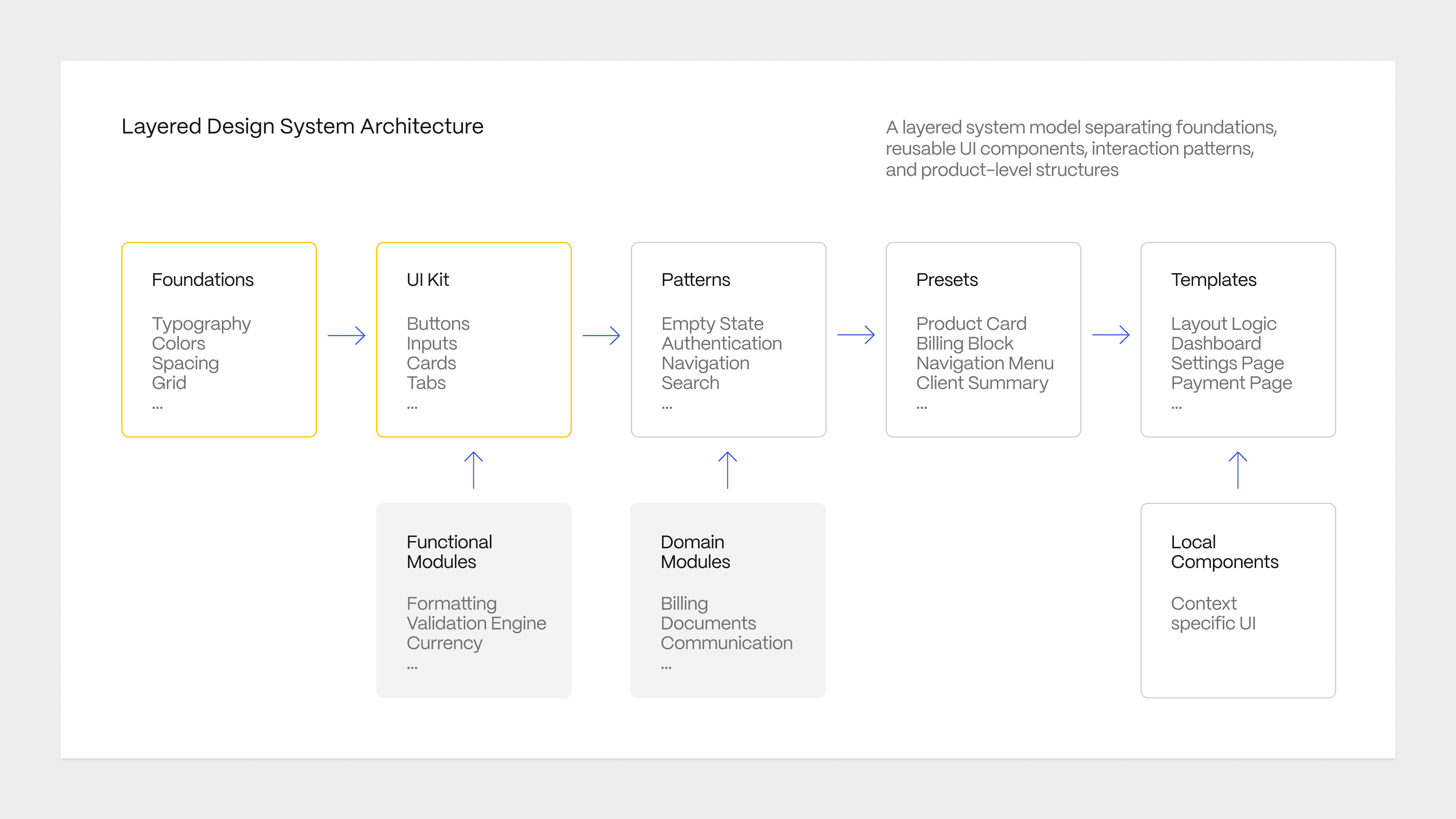
Layered design system architecture
The core architectural decision was to give every design element a place in the system and a clear rule for how it should move through it.
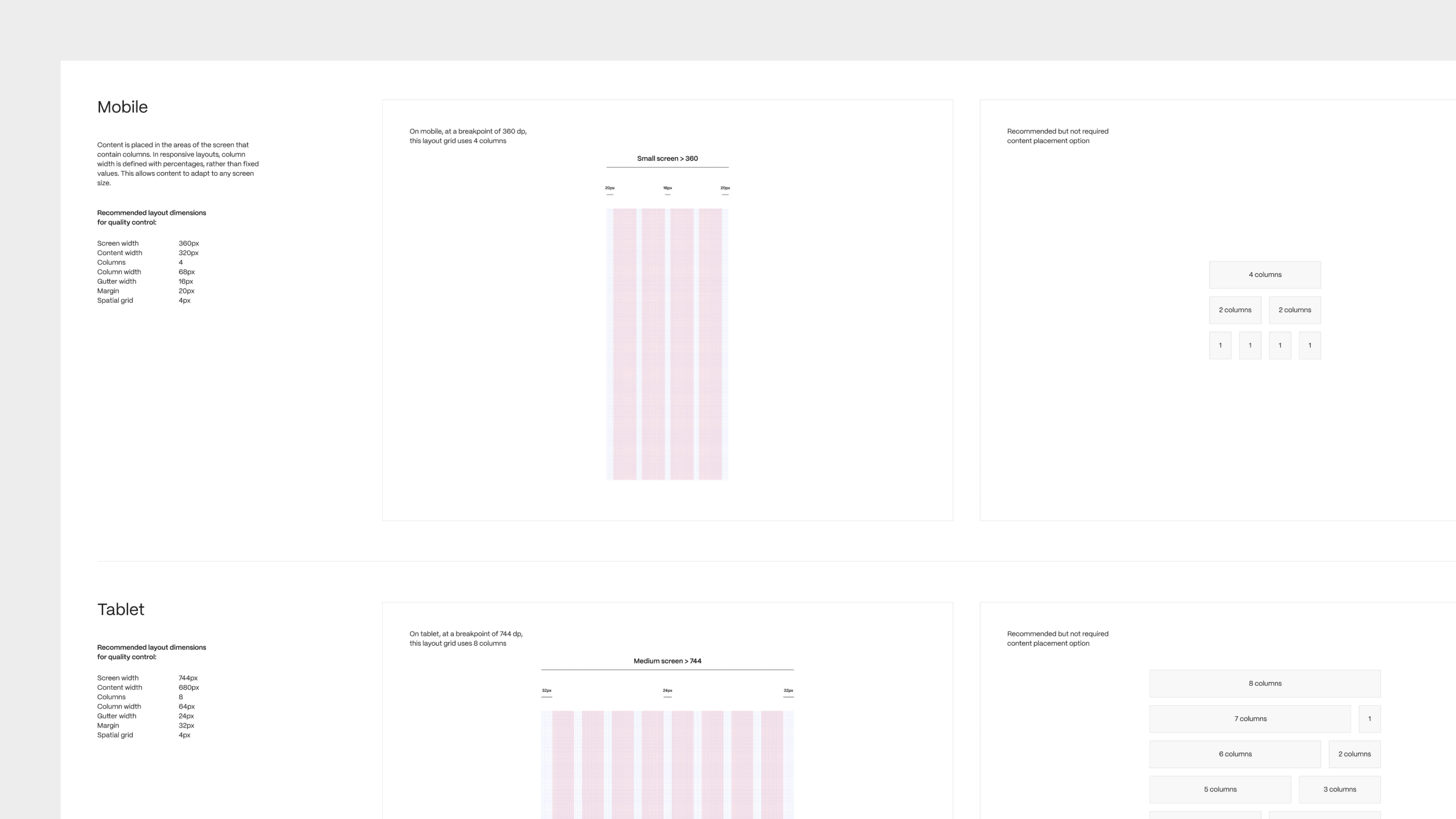
The layered model separated foundations, UI components, interaction patterns, presets, and templates at the global level, while preserving space for functional modules, domain-specific solutions, and local components that had not yet proven reusability.
This distinction mattered because it answered the question teams were constantly asking: do I reuse something that exists, create something new locally, or escalate a decision into the system? Without a clear model, every team answered that question differently. With it, decisions became consistent and traceable.
The diagram shows the full architecture. The layers above the line are global and shared. The layers below feed into the system as decisions mature and prove their value across domains.
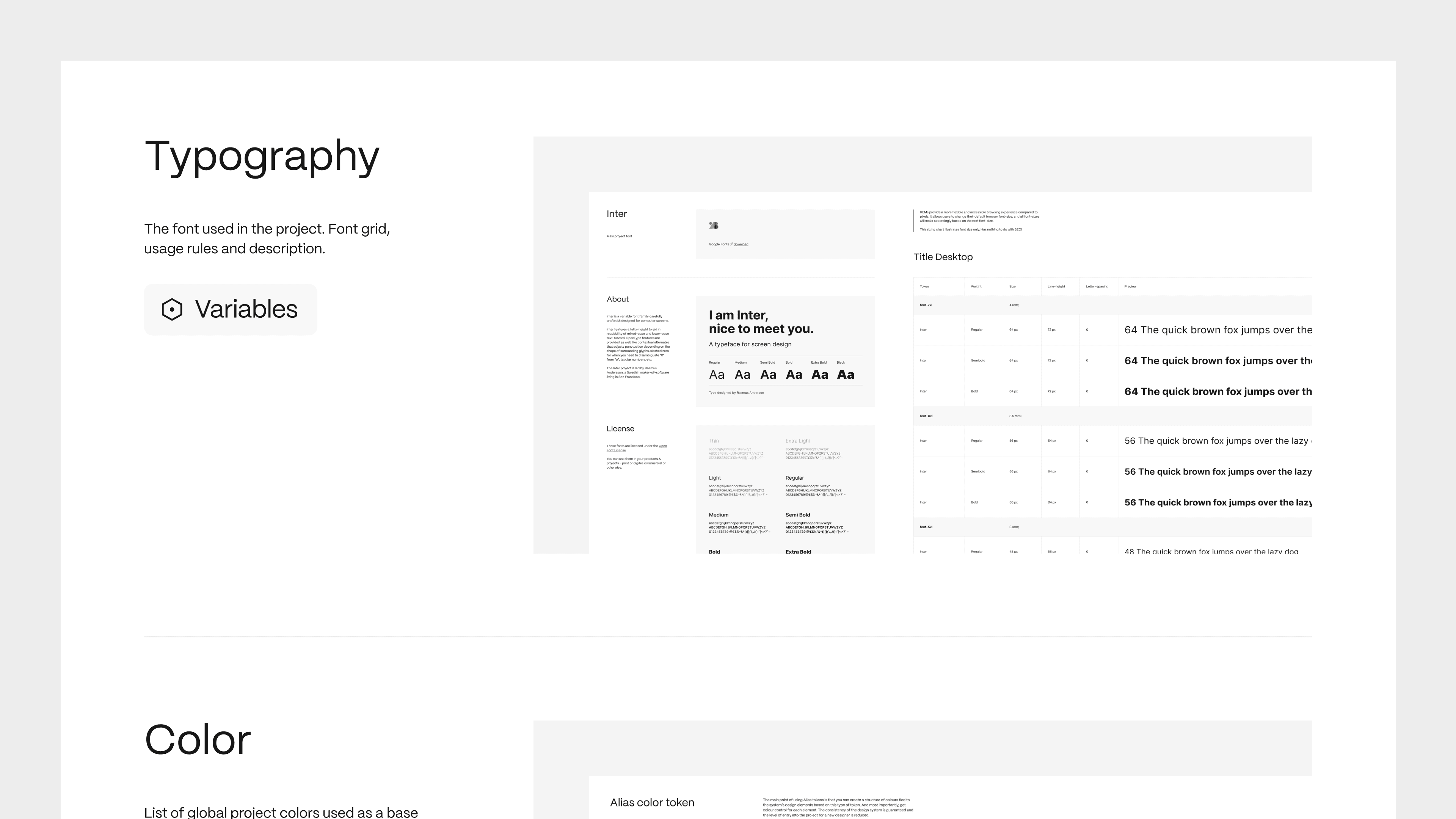
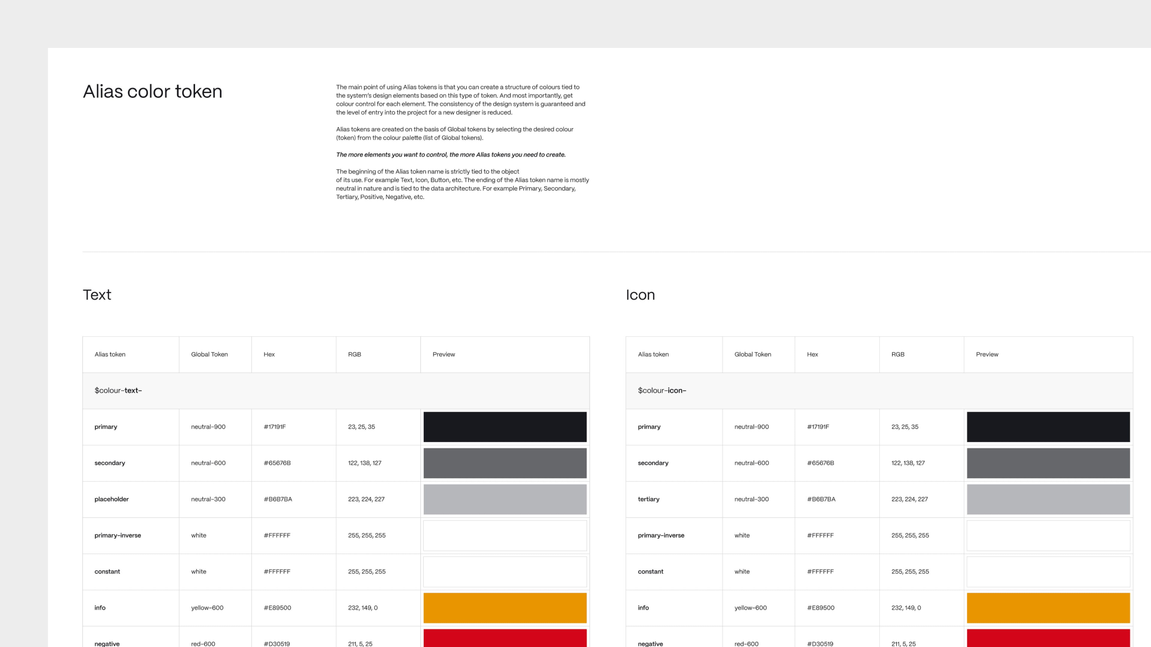
Foundations and token taxonomy
Before the token system existed, colour, typography, spacing and states were defined differently across platforms. A decision made in the brand layer had no guaranteed path into the product UI, and no guaranteed path from there into implementation.
I structured the foundation layer around a three-tier token taxonomy: primitive values, semantic tokens, and component-level decisions. This separation gave each layer of the system a clear language to work in, and gave engineering a reliable contract for implementation.
The result was that foundational decisions became portable. A change at the primitive level could propagate correctly through the system without requiring manual updates across every component and platform.

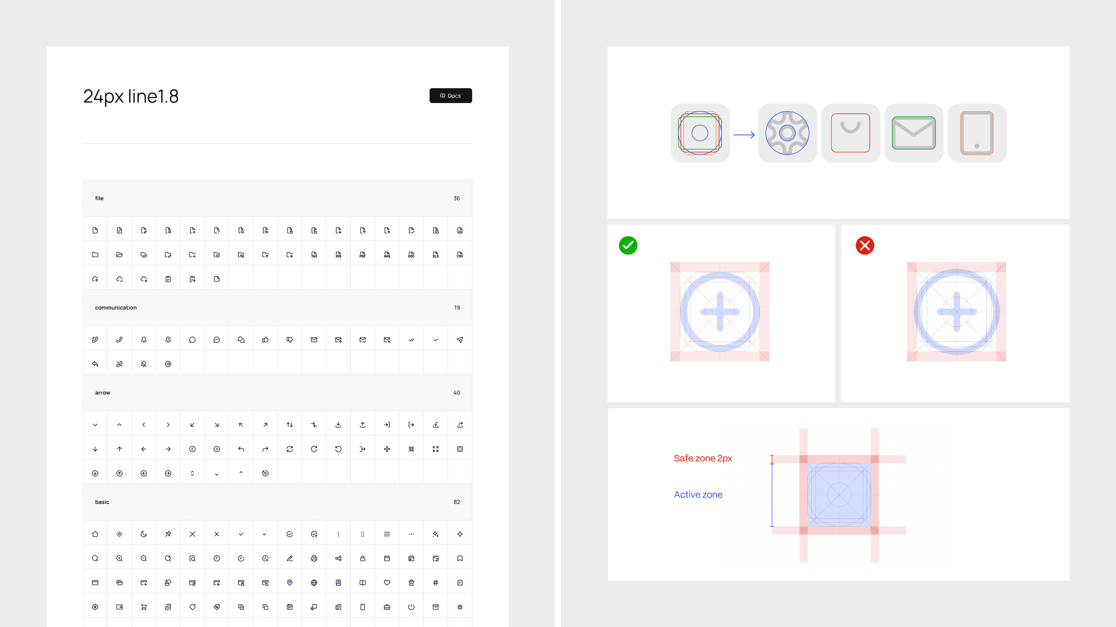
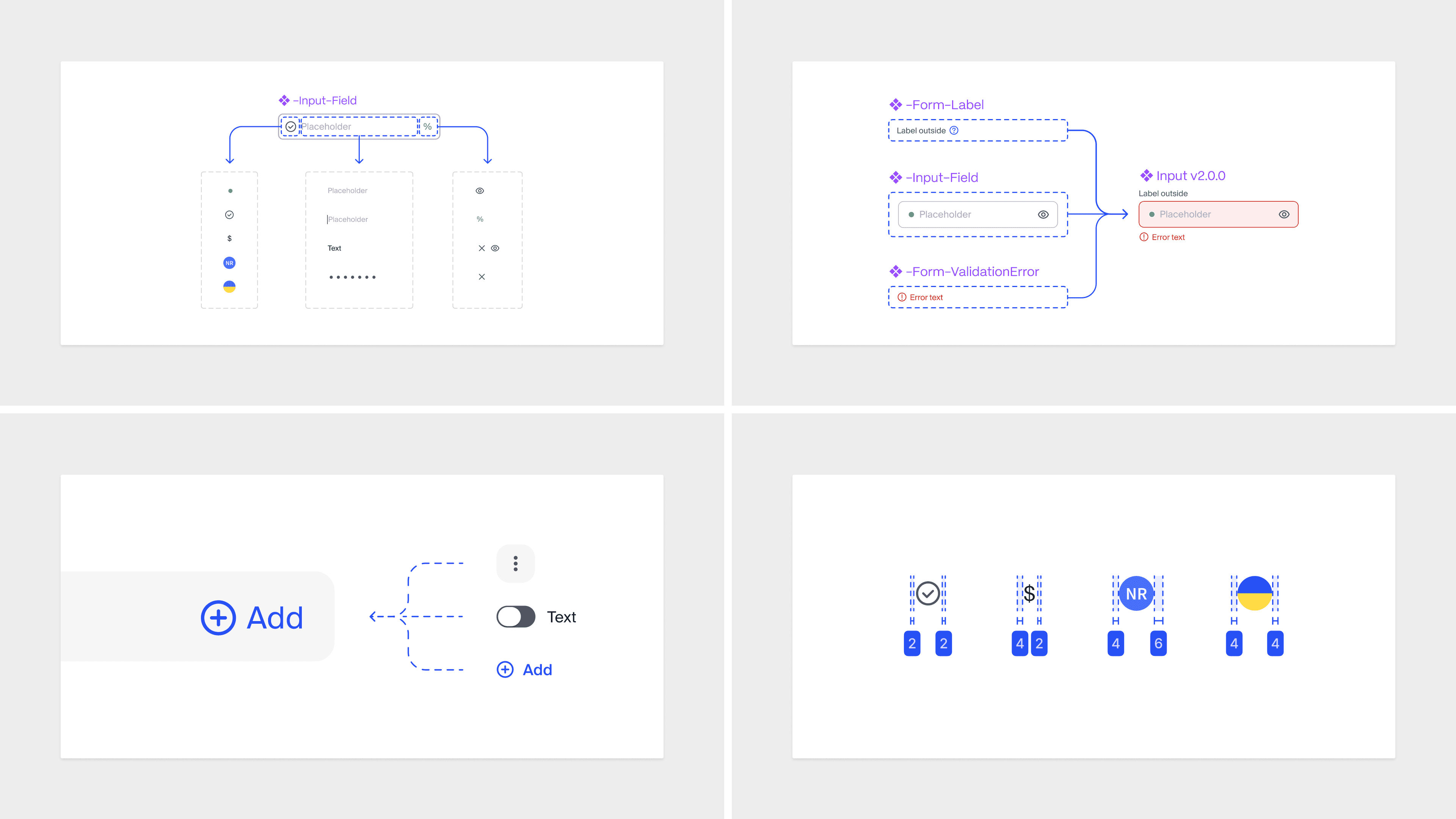
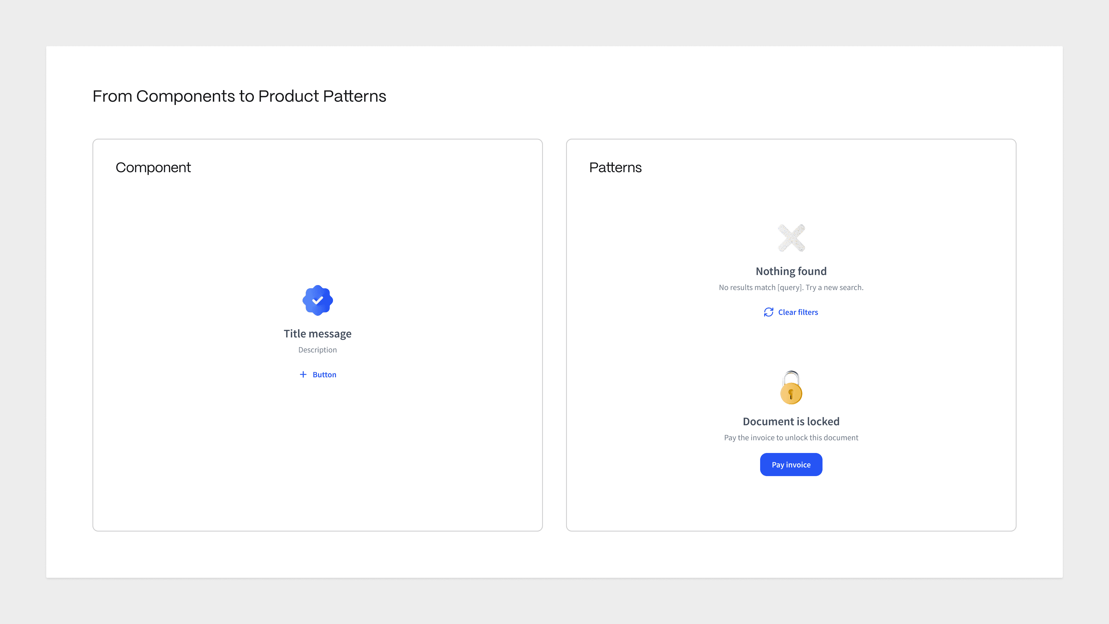
From components to product patterns
One of the most important architectural decisions I made was to formally separate UI components from interaction patterns and treat them as different types of system knowledge.
Before this distinction existed, teams were trying to solve product behaviour problems with component solutions. Empty states, validation flows, search results and permission scenarios were being rebuilt from scratch each time because there was no shared model for how these moments should behave across the product.
The pattern layer changed this. Instead of documenting what something looks like, patterns documented how a product scenario works: what triggers it, what states it moves through, what content rules apply, and what dependencies exist. This gave teams reusable decision-making, not just reusable UI.
The result was that recurring product problems stopped being solved repeatedly. Once a pattern was defined, it became the reference for every team working on that scenario across all platforms.


Connecting design decisions to implementation
The gap between design and engineering was not a tooling problem. It was a shared language problem. Designers and engineers were working from different references, making different assumptions, and resolving conflicts late in the delivery cycle when the cost of change was highest.
I defined a workflow that gave both sides a single source of truth. Design decisions made in Figma were documented with explicit usage rules, interaction states and implementation constraints. Those decisions were then synchronised with Storybook so engineers worked from the same reference designers used, not a separate interpretation of it.
This made design decisions traceable in both directions: from system foundations through to product screens, and from product screens back into reusable system rules. Ambiguity that previously surfaced during QA began surfacing earlier, where it was cheaper and faster to resolve.

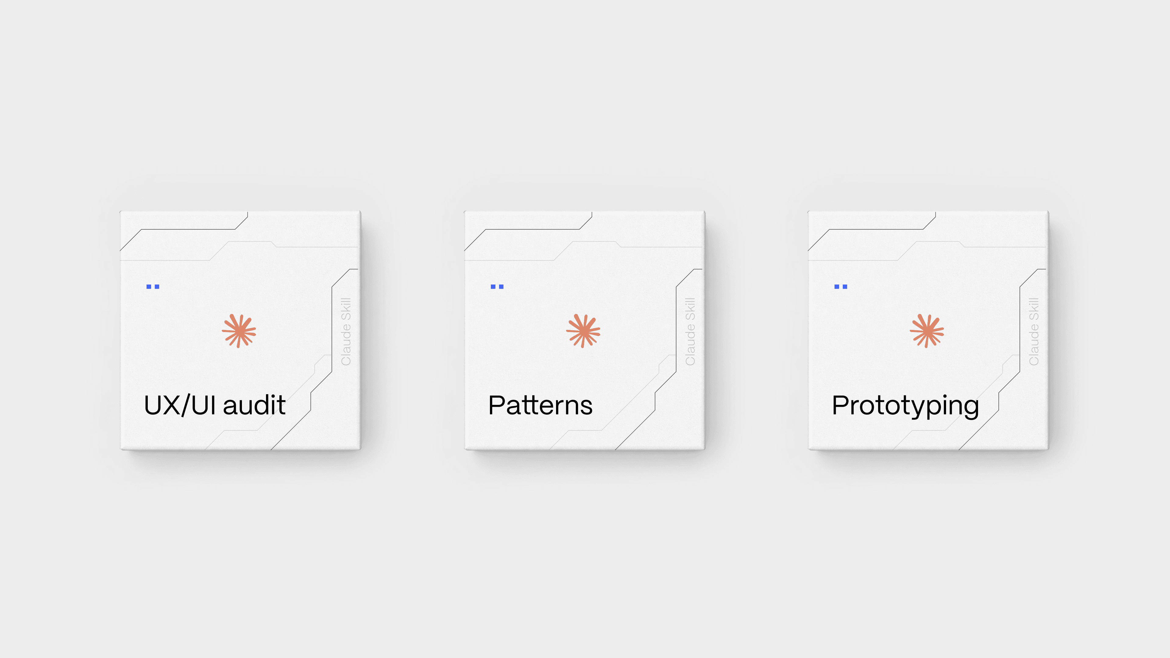
AI-assisted workflows
A well-structured system creates a new possibility: it can become machine-readable. Once the architecture, constraints, and pattern logic were defined and documented, I made a deliberate decision to build AI-assisted workflows directly on top of the system rather than alongside it.
Three custom skills were built on top of the design system architecture, each addressing a different bottleneck in the team's workflow:
UX/UI and WCAG audit
Interfaces are analysed against system rules and accessibility standards, with findings mapped back to specific component and pattern decisions rather than producing generic feedback.
Pattern writing
Interaction patterns are documented through a structured skill that extracts product logic, states, content rules and dependencies from design work into system-ready format.
Prototype generation
UI screens are generated from existing components, tokens and pattern constraints, keeping output consistent with the system by design rather than by manual review.
This moved the system from a passive reference into an active operating layer. Teams could query it, extend it, and use it to accelerate work without stepping outside the constraints that made the system coherent in the first place.

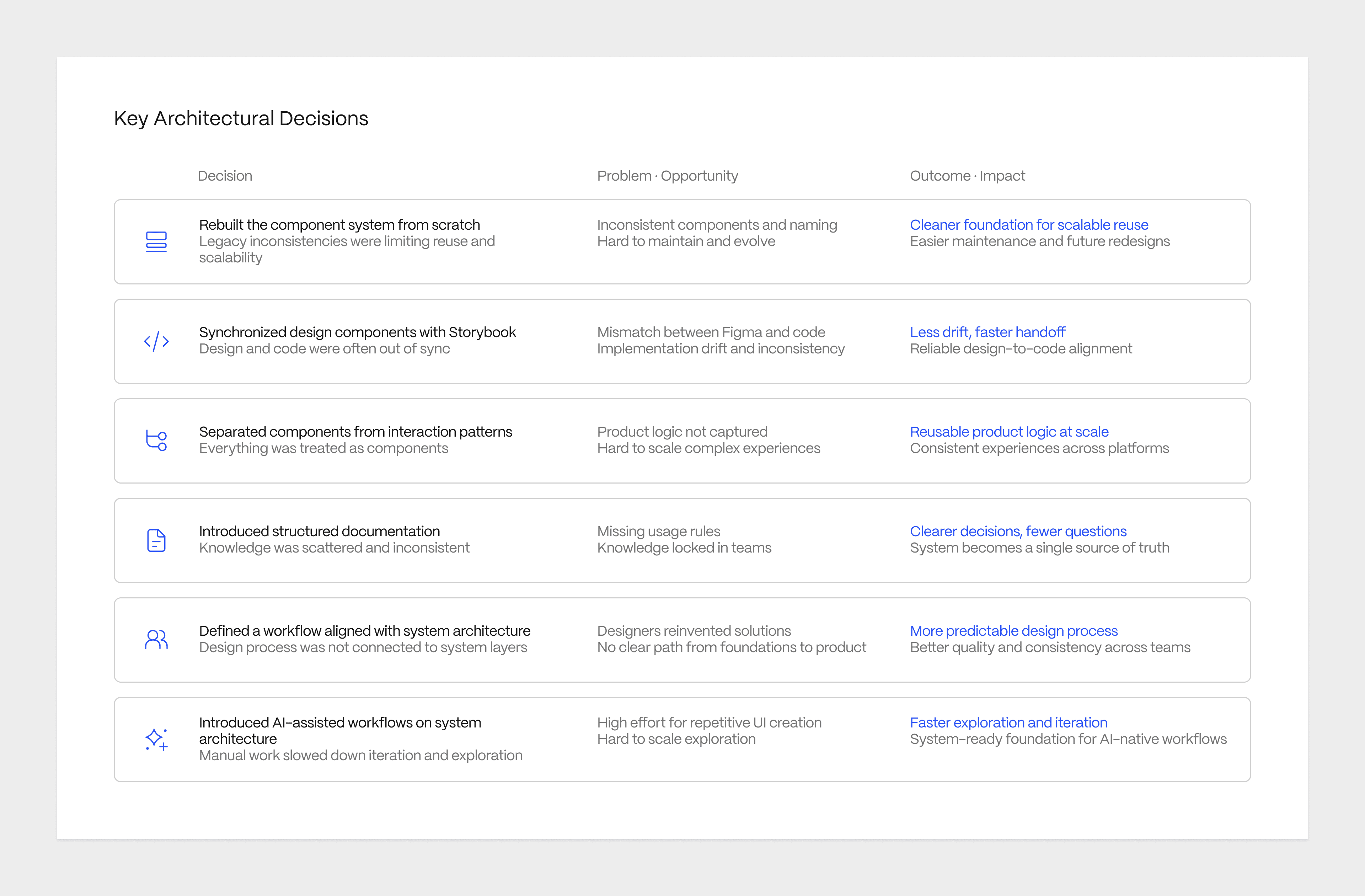
Key architectural decisions
Rebuilt the component system from scratch rather than patching the existing one, because the legacy structure had accumulated too many local inconsistencies to serve as a reliable foundation for future redesign.
Synchronised design components with Storybook implementation to eliminate the gap between design reference and engineering reference, reducing handoff ambiguity and implementation drift.
Separated reusable components from interaction patterns because conflating the two was causing teams to solve product behaviour problems with UI solutions, creating duplication instead of reuse.
Introduced structured documentation for components and patterns so that usage rules, states, constraints and examples became part of the system itself, not scattered team knowledge that left with people when they moved on.
Defined a new workflow for designers aligned with system architecture so teams could navigate the layers confidently rather than defaulting to local decisions under delivery pressure.
Introduced AI-assisted workflows built on system architecture, making the structured layer executable and queryable rather than a passive reference that required manual interpretation.
After-state
The architecture delivered three things the organisation did not have before: a shared language for product experience decisions, a system that teams could actively use rather than passively reference, and a foundation scalable enough to support the product's next stage of growth.
The scale of the system reflects the scope of the problem it addressed: 15+ product modules, 150+ core UI Kit components, and 30+ UX patterns, unified under a single architecture. UI inconsistencies across platforms reduced by approximately 50%. Design rework dropped to 4.9% through standardised component usage, documented patterns, and aligned design-engineering workflows.
Design-to-development delivery accelerated by up to 3x through an AI-assisted workflow built directly on the system architecture, connecting Figma, Claude, and Code Connect into a traceable delivery pipeline.
Most importantly, the organisation gained a shared decision-making model. Teams understood when to reuse, when to create locally, and when to promote a decision into the system. That clarity was the outcome that made everything else sustainable.
← Back to Index
or look for the latest projects

