Service
Mobile apps
Branding
Project
Wi-Fi Heatmap is a mobile app for mapping wireless signal coverage in real space. Users walk through a building or outdoor area, and the app builds a visual heatmap showing where signal is strong, weak, or absent.
The product had an active user base and solid technical core. But the interface had grown inconsistent: visually outdated, architecturally fragmented, and difficult to navigate as new features were layered on top of old decisions.
My work covered the full design scope: new visual identity, rebuilt information architecture, redesigned core flows, and a component structure aligned with native platform patterns, across both Android and iOS.
Impact:
Before redesign: < 400,000 installs
After redesign: > 1,000,000 installs
This was not a visual refresh. It was a structural redesign of how a technically capable tool communicates and delivers its value to users who just want to know where their Wi-Fi works.

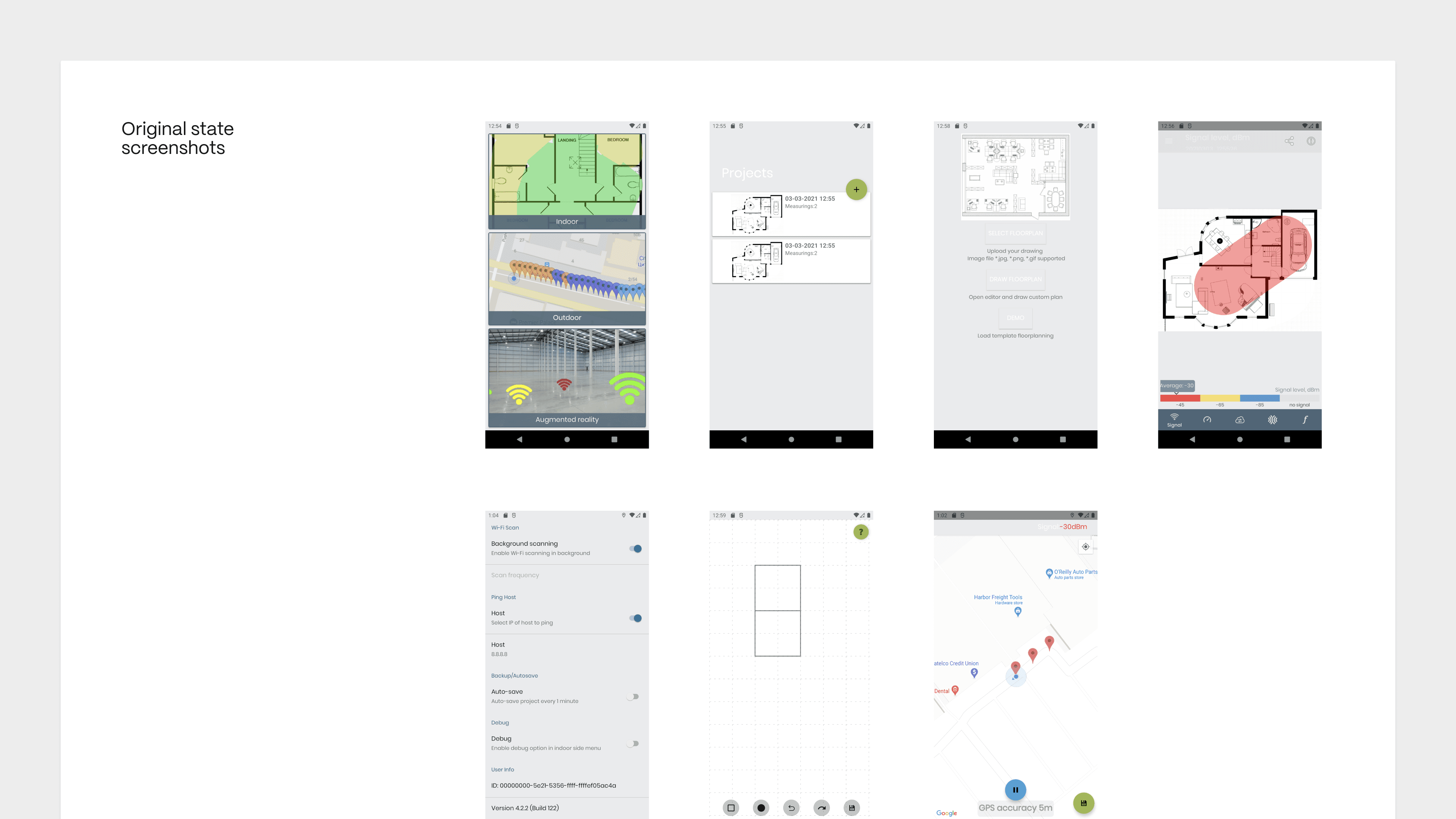
Before-state
The app was built by a developer without a designer involved. It started with one main screen and a defined set of features, then grew.
Each new feature was added on top of the existing structure. Without architectural planning from the start, the navigation never evolved to match the product. There was no menu. All transitions happened through a single button that wasn't really a menu button at all.
That button became a bottleneck. Users who didn't know to tap it never discovered the features behind it. The product's actual depth was invisible.
On top of that: no visual identity, no branding, no design language. The interface existed purely as technical scaffolding: functional, but with nothing to make a user want to stay.
Approach
We started with architecture. First, we mapped the user journey: what a person actually does in the app, step by step. From that flow we defined the navigation structure and which features belong at each stage.
Only then we moved to visual language: building a new identity, icon, and UI system that gave the product a clear character and positioning it didn't have before.
Dark and light themes, two languages, a component structure that could grow with the product.
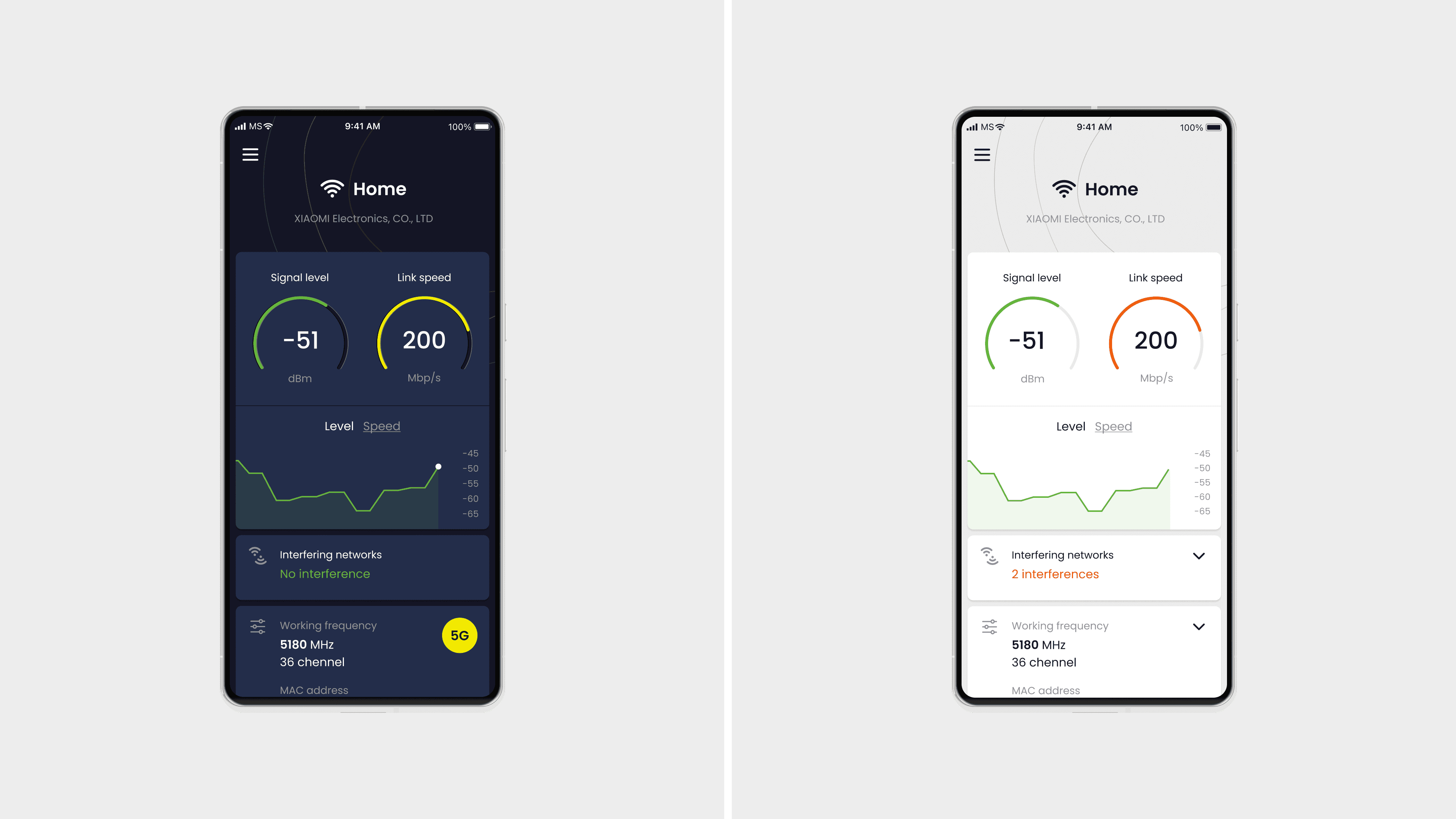
Main screen
The home screen shows what matters most: signal strength and connection speed, readable at a glance.
Data is ordered by relevance. Interference warnings appear only when they affect quality. Technical details like frequency, MAC address, and IP are accessible but not in the way.
The coverage map is one tap away from the bottom of the screen.

Coverage map
The core feature: walk through your space while the app builds a live heatmap showing where signal is strong, weak, or absent.
Three ways to set up a floor plan: upload an image, draw a simple layout using the built-in constructor, or let GPS map the area automatically when working outdoors.
Signal, Speed, and Ping modes let you read the same space through different lenses.

Navigation
The original app had no menu. All navigation went through a single button that most users never recognised as an entry point. Features were there, but invisible. The product's actual depth was hidden behind an unclear interaction.
We introduced a clear side menu with three zones: current session, projects, and configuration. Each zone answers a different question about what the user needs right now.

Settings
The original settings were one flat list with no structure. We split them into three focused screens: Basic, Indoor, and Signal levels. Each screen covers one context, one set of decisions. Less to read at once, easier to find what you need.

Subscription
The original screen showed all options at equal weight. Nothing stood out as the main choice. We introduced a clear hierarchy: one primary tier at the top, supporting options below. The decision path became obvious.

Result
After the redesign the app grew from 400K to 1M+ installs.
4.1 stars, 8K+ reviews on Google Play.

← Back to Index
or look for the latest projects

